Albright Insights Indoor Navigation System
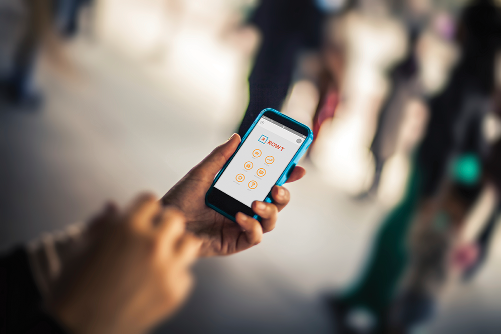
ROWT is a Bluetooth-based indoor navigation system that consists of both a mobile app and proprietary Bluetooth beacon technology.
The mobile app (available for iOS and Android) allows users to view a building’s floor plan, browse and select from a library of destinations, or define their own. Via special access features, building administrators can use the mobile app to set up the system, manage the library of destinations and floor plans, and monitor user activity.
Initially focused on healthcare industry applications, the leadership of the startup company, Albright Insights, and their investors approached me to lead the development of the user experience architecture, technical architecture and functionality definition, user interface design, patent authoring and beta release of their funded project, ROWT.
Designing the Hardware

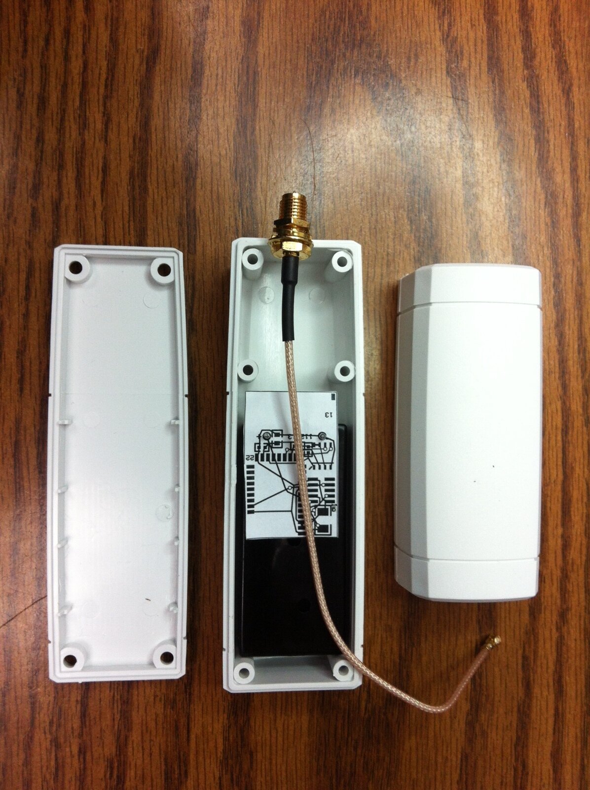
In collaboration with the hardware vendor, prototypes of the Bluetooth beacons were produced based on custom circuit board designs that utilized off-the-shelf prototype housings.
I spent the first phase of the engagement mapping out the overall project and experiential goals. It was determined early on that purchasers of the system would need it to be easy to set up and maintain, requiring no special training or skills; require no pre-mapping of the floor plan to give accurate (within 5 – 6 ft.) location data; be powered independently, requiring no secondary integration with existing power conduits.
As a result, the team, under my leadership, opted to go with a custom Bluetooth hardware solution built with Bluegiga boards to have the most control over firmware performance and power consumption.

Architecting the Experience
I built two teams to work on the system simultaneously: one for hardware; the other for software. The system was intended to run on smartphones and tablets and it was requested that we demo it on iOS first. I began working with both teams to map out system interactions and user navigation flows.

Comprehensive user flows were produced to inform the software, hardware and investor team

The Void's progressive mapping functionality (left to right) first, monitors traffic patterns; then, visually defines those areas dynamically; and, finally, requests administrative feedback for location tagging.
Defining the "Void"
A major aspect of the system was its ability to "learn" floor plans without prior administration, solely through how users moved around in a space. The concept I designed was similar to Dig Dug where as users moved through the space, they would open up paths for the system to see. As the system accumulated these paths it could ascertain walls, furniture and the like. Thus, obviating the need to pre-upload a floor plan to begin using the system or revising a floor plan should obstacles change (e.g. new construction or a temporary reconfigure of a conference space floor plan).
Wireframes and Screenflows
While coordinating the evolution of system requirements with the hardware team, I wireframed all of the mobile user and web administrator screens. I maintained close contact with the hardware team during the formative phases of the wireframing effort to ensure relevant functional requirement impacts were mitigated in the flows provided to the design team.

UI was designed to have few functions per screen to simplify interaction for less experienced users.
Creative Direction
The brand went through several evolutions during the project. Wireframes were passed to the design team for color treatment and final pixel perfect production. I provided art-direction on everything from the foundational style sheet and logo to the iconography and font selection to ensure a consistent look throughout the system.

Route selection menu with expandable actions

Route detail screens

Turn-by-turn direction screen

In-app alert screens
Live Beta
The first live test of the complete system in a live environment at Spectrum Health. We got access to two stories and about 10,000 of the site's 5 million square feet to run the test in. One of the things we were most concerned with was the potential electromagnetic interference from the nearby Radiology Lab in our test area. However, it turned out it wasn't a problem. The system was even able to "figure out" elevators.
In-field setup and debugging time was 4 weeks, and the test ran in the live environment for a little over 6 weeks. Patents were awarded six months later.
