LendingClub Finance Experience Redesign
Can applying for a loan be enjoyable?
Applicant Friction
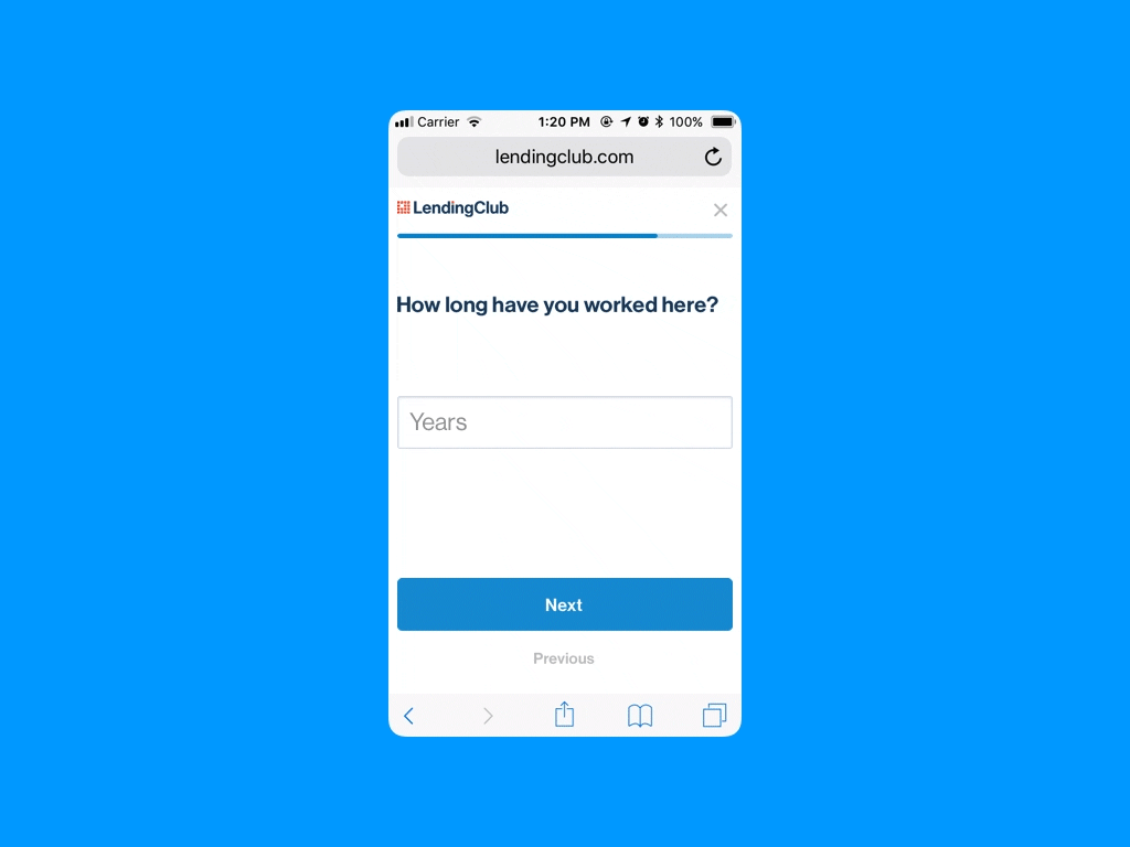
Applying for a loan is never easy or fun. Applicants are often expected to slog through countless forms probing every corner of their credit history, often with the most esoteric or confusing language. In the case of LendingClub, this process was a longer and less intuitive experience than many applicants would hope for—lacking clear indication of what stage the application process was and what was needed to successfully complete it. This resulted in a high number of drop-offs and incompletions and, as a central driver to the conversion funnel, was a critical focus area.
As the principle UX, I took on the challenge of bringing some intuitiveness (and maybe a little joy) into the whole experience.
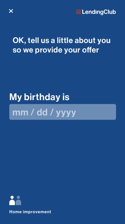
North Star "Ribbon" Application experience

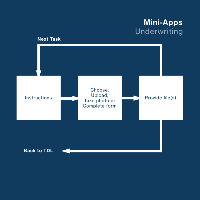
North Star Mini-Apps Underwriting experience
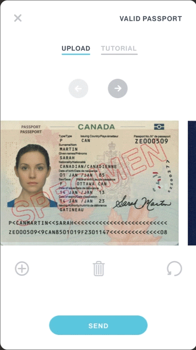
North Star Mini App experience
Guiding the Vision
The UX team, of approximately 25, separated into 3 teams, were all working on parts of the overall experience, so it was important to provide a vision that would unify their design efforts and aim them at a common, compatible destination.
To accomplish this, I hosted a series of Salons where I showcased the progress on the North Star experiences. These presentations gave me the opportunity to engage the team in discussion, open the process and thinking with them and provide insights to influence and align their work.


The E2E framework

Navigating the North Star
The E2E program, as it was called, divided the lifecycle of an applicant/Club member into three principal stages: Funnel, Underwriting and Post Issuance. These phases gave the teams room to explore and devise near-term solutions that integrated with each other and worked towards the goal experiences set out in North Star.
North Star grappled with the biggest, most ambiguous issues and explored the most unconventional solutions. In collaboration with product management leads, the North Star vision was continually being iteratively refined both with quantitative data from financial modeling and market performance and qualitative insights from ongoing user testing.
Other explorations for the North Star Application experience
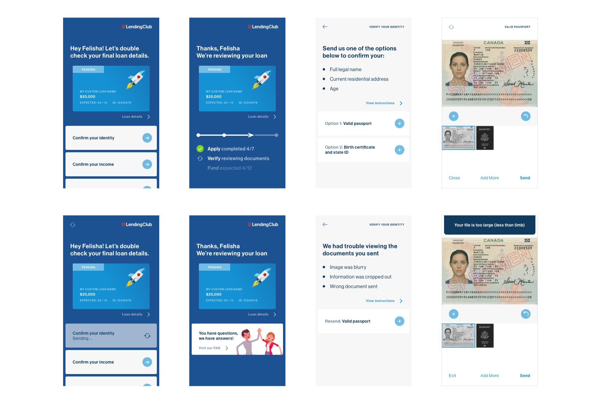
The North Star Mini-Apps Underwriting experience provides clearer calls to action and statefulness
The Ribbon
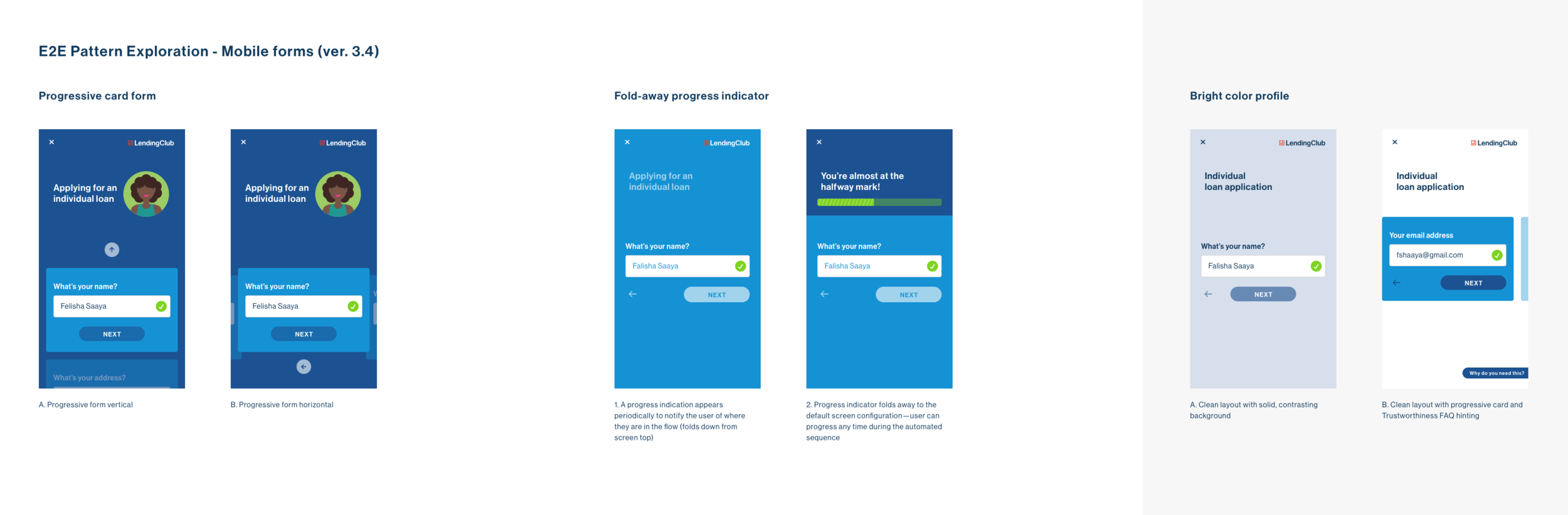
The Ribbon concept for the Application stage seeks to address key applicant pain points through innovations in presentation and interaction. The original flow did not account for the necessity to provide information in a different order than what was presented. For instance, if an applicant didn’t have an obscure piece of information readily available when completing the form, they would be blocked until they provided it with no easy way to skip ahead and return to provide key provisions later. This would often lead to user abandonment both explicitly or incidentally, due to timeouts. The Ribbon allowed users to see all the questions up front so that they could gather everything needed to complete the form when they started or answer them non sequentially if necessary.
After completion, this concept also allowed applicants to easily review and edit information without exiting the application stream, going to a different page or using the Back button on their mobile browser (a common user mitigation that contributed to lost data, timeouts and failed completions).

The shortened North Star Application flow is adaptive and requests only the most necessary information
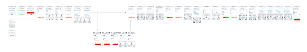
The original flow was exceptionally longer and easy to get lost in
Probing for the Bullseye
A prototype was built in React (using a framework I co-developed with the Engineering team for rapid, high-fidelity testing) and researched in a series of in-person user interviews. The overall response was positive. Participants found both the method and UI intuitive and easy to understand. Insights from these tests informed future iterations of both North Star and the near-term production work, such as providing clear onscreen accommodations for blinding and revealing secure data (like SSN) and clearer terminology for some of the fields.

Click thumbnail to view the user research
The production Application and Underwriting experiences as influenced by North Star

